A Fresh Look. The Same Trusted ERSGA Service.
Effective May 6, 2026: ERSGA's New Logo

ERSGA’s new logo is more than a visual update. It is a thoughtful evolution of who ERSGA is, how we serve the State of Georgia, and how we show up for the members, retirees, beneficiaries, and employers who rely on us every day.
![]()
Our new logo draws inspiration from the State of Georgia’s digital seal, incorporating the familiar arch motif as a subtle but meaningful connection to our foundation. The arches represent strength, structure, and continuity. They reflect the enduring commitment we have made for generations to support the financial futures of those in service to our local communities.
The deep blue at the heart of our brand was chosen with purpose. Blue signals trust, stability, and security. It reflects the confidence our members place in us as stewards of their retirement and the responsibility we carry to protect and deliver on that promise to our retirees and beneficiaries.

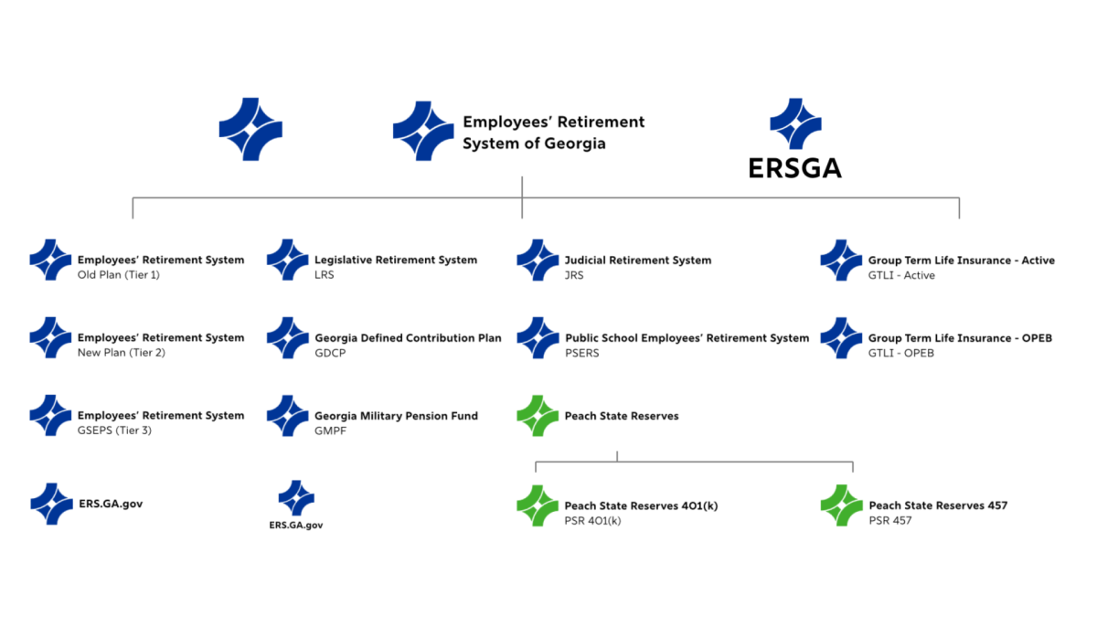
Alongside our primary brand, Peach State Reserves (PSR) now features its own distinct green identity. This vibrant green represents growth, opportunity, and forward momentum. It reinforces the role that the PSR 401(k) and 457 plans play in helping members build and strengthen their financial future through savings and investment.
Together, these elements create a brand that is clear, modern, and accessible, while remaining grounded in our mission and legacy. The simplified design also supports our commitment to accessibility, aligning with ADA standards by improving clarity and readability across platforms. In addition, the streamlined use of color allows for more efficient and cost effective production across materials.
As we move forward, you will begin to see this new look across our materials, communications, and spaces.
This is more than a new logo.
It is a renewed expression of who we are as ERSGA.
Proudly serving those who serve Georgia.